So I don’t think it’s a giant surprise that I’m not much of an artist. It’s not really for lack of anything; I’ve just never really practiced to a point where I’ve been doing it well enough.
I’m also aphantastic, which means that I don’t make mental images. That’s always made it fairly hard for me to do stuff visually because I don’t really come up with concepts.
However, I’ve been trying to work on visual imagination with some deliberate exercises (mostly amateurish efforts; I’ve seen methods that people have touted but never had the discipline to follow through). It’s been very hit or miss.
That didn’t stop me from doing some drawing today. I’ve been doing a lot of listening to news and audiobooks, and I tend to play a lot of low-brainpower games while doing that. There’s nothing wrong with that, but I don’t find the use of time particularly satisfying, and I have a hard time justifying doing it enough to get through a more rigorous audiobook.
I also got the full Affinity suite recently, and I love it despite some of its shortcomings. So I figured I’d do some sketches while I work on stuff. Affinity Designer is tremendous for this.
And when I say sketches, most of what I do is just half-hearted sketching, and I’m not really going to bother sharing it. It’s pretty primitive, and while I’m not ashamed of it I’m not going to waste peoples’ time on it.
I’ve had the idea of trying to do this abstract futuristic city for either a game or just to have as art somewhere.
However, today I actually churned out something I feel fairly proud of. The first draft was cool and more or less wound up where I wanted it to be, but just didn’t have the style I wanted. I’ll post it at the end here, but suffice it to say that I didn’t really care for it.
Not being deterred, I decided to go on to do a second draft.

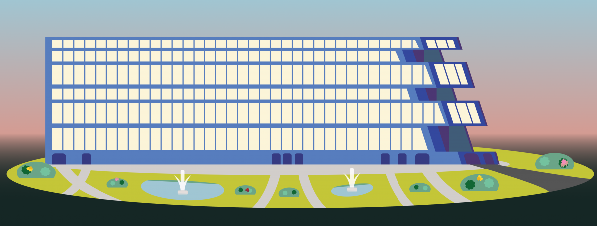
Here we have a lot more in the way of a scene, which helps quite a bit when it comes time to frame our building. It’s not perfect; one thing that I’m finding kind of aggravating is the scale of things; it seems like this building is terribly horizontal for what it is, so either a vertical addition or a good reason for it to be short would be nice. It’s all done in vector, so it’s theoretically trivial to take the left-most side and lop a bunch of it off.
However, I like the simple sci-fi concept.
This was the first draft:

Ta-da!
As a piece, the first version’s got some obvious issues. I like the colors (which I got from a palette off the internet, part of the companion to a tutorial on YouTube), but the scale seems a little off, and it’s not clear that it’s supposed to be a building. The little antennae and helicopter pad on the roof don’t seem to fit in, though the antennae are probably fine.
The part that probably is the most off-setting here (to me at least) is that the levels are not only unequal but unequal because I didn’t measure rather than by design in the second version. I also figured out how to do a couple things while I was working on this.
I plan to keep working on a number of city elements that can be combined into a variety of structures and interesting skylines.
One step of that is probably cutting this building down to scale a little.